Announcement Page
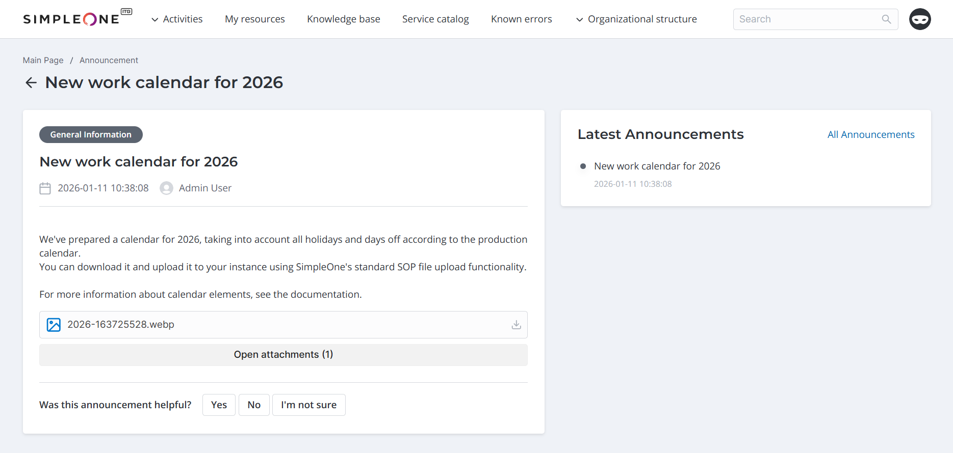
An announcement page consists of the following elements:
- The breadcrumbs widget that allows users to navigate through the structure of the portal pages.
- The Announcement Content that displays full text of an announcement.
- The Last Announcements widget that displays the list of the latest published announcements.
The announcement page looks as shown below:
Breadcrumbs configuration
To configure breadcrumbs correctly, we recommend using the attribute values shown in the example below. Type these values in the Template field of the <breadcrumbs> widget form:
<div class="announcement__breadcrumbs">
  <breadcrumbs>
</div>
Announcement Content widget
The Announcement Content widget is represented as a card with an announcement text. The files attached to the announcement record are always available for viewing on the portal. To use the widget on any portal page, add the widget instance to the target page, for example, the main page or a dedicated announcement page. In the out-of-the-box version, you can find the widget in the /portal/announcement page.
In this version, the widget has no schema options.
Last Announcements widget
The Last Announcements widget is designed to access the latest published announcements easily by clicking the needed one in the list. In the out-of-the-box version, the widget is located in the announcement page to the right from the Announcement Content widget and is titled Latest announcements.
You can configure the widget layout.
Schema options for the Last Announcements widget
| Option | Mandatory | Description |
|---|---|---|
| announcementCount | N | Specify the number of announcements displayed in the list. Default value: 6. |
| announcementCountMobile | N | Specify the number of announcements displayed on mobile devices (screen width is less than 768px). Default value: 3. |
| allAnnouncementsLink | N | Specify the link for redirection when All announcements is clicked. Default value: /portal/announcement. |
{
  "announcementCount": 6,
  "announcementCountMobile": 3
  "allAnnouncementsLink": "/portal/announcements",
  }
Announcement Page Portal Widget
In ESM platform versions 2.2.0 and newer, the Announcement Page Portal Widget is considered deprecated. Instead, use the Announcement Content and Last Announcements widgets.
The widget consists of two sections – a card with the announcement content and another section with the list of the latest announcements to access them easily.
To use the widget on any portal page, add the widget instance to the target page, for example, the main page of the portal.
To modify an announcement appearance, clone a widget template and make changes in your copy:
- Navigate to the widget form and open the burger menu .
- Click Make a copy.
- Change the copy, and use it on the portal pages.
- Specify the newly created and configured widget in the Widget field of the related Widget Instance record. To do so, complete the steps below:
- Navigate to Portal Structure → Widget Instances.
- Select the created widget instance.
- Click the record to modify it.
- Specify your widget in the Widget field.
- Click Save or Save and exit to apply the changes.
Create a support ticket
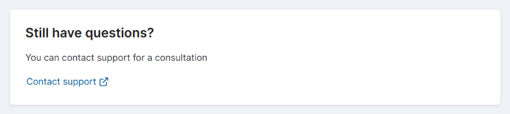
If the instance has the ITSM application configured, the announcement page allows users to contact support for more information or help.
Clicking the Contact support button in the Still have questions? widget opens the user query form in a new tab. Users need to fill in the form fields and click Save. Once the ticket is processed by an agent, the caller can track it by selecting Activities → Tickets in the portal header.
Feedback widget on announcement form
The feedback widget is configured separately for each announcement.
The feedback widget is configured separately for each announcement. To do so, navigate to an announcement in the agent interface and select the via Portal and Enable feedback checkboxes on its form. Then, specify the Feedback question and Feedback answer options to be displayed in the announcement. The feedback question and answer options displayed are also configurable. Read more in the Create Announcement article.
When submitting feedback on a portal announcement form, users can not only choose an answer option but also leave a comment. They can change their answer by selecting another option.
The feedback left by users is stored in the Announcement Feedback (announcement_feedback) table. To open the list, navigate to Announcements → Announcement Feedback.