Create Knowledge Base Articles
Roles required:
- Create – admin, knowledge_admin, knowledge_agent.
- Read – admin, service_catalog_manager, knowledge_admin; knowledge_agent if this user is responsible for, or is part of the group responsible for, the specified KB category or Content DB, or can edit the specified KB category. Users with other roles can only view the published articles that have the External object category.
- Update – admin; knowledge_admin if the article is not published; knowledge_agent if this user is responsible for, or is part of the group responsible for, the specified KB category or Content DB, or can edit the specified KB category.
- Delete – admin.
The workflow for creating and editing an article depends on its format:
- Block articles are completed in the Article editor. In this case, an article's content is divided into blocks of different types.
- HTML articles are completed in the HTML editor on the article's form.
On the portal, the article is displayed the same regardless of its format.
A Blocks article in any state except Published can be converted to HTML. To do so, select Change format to HTML in the burger menu on the form of the article you need to convert. All of its blocks, including any added images, will be converted without any changes to their display and added to the Content field on the article form.
Note that the reverse conversion (from HTML to Blocks) is impossible.
Blocks
To create an article in the Blocks format, follow these steps:
- Navigate to Knowledge Base → All articles or My articles.
- Click New on the list view. You can also open an existing article's form and click New there.
- Fill in the article fields. In the Format field, select Blocks.
- Click Save.
After creating the article, you can proceed to completing it in the Article editor. To do so, click Open editor in the upper-right corner of the form.
The Article editor saves any changes you make to the article content automatically. However, you need to publish them for them to appear on the portal.
Use blocks
To add an article block in the Article editor, complete the following steps:
-
Press the
/key. You can also move the pointer over the line with the block creation hint or an existing block and click . To create a block of the Content type directly, click the line with the block creation hint. -
Select the block type you need. By default, the following types are available:
- Use Content blocks for adding text and images.
- Use Heading blocks for adding headings. You can use the added headings for article navigation.
- Use Separator blocks for adding separating lines.
infoAdmin users can configure other block types.
-
For Content and Heading blocks, add their contents.
To view the Content formatting options, click . You can also format a text you already added by selecting it and choosing the appropriate option in the menu that appears.
-
Press
Enteror click anywhere outside the field to save the block with its contents.
The blocks you create are added to the Article Block (article_block) table. All the changes made to the blocks via the Article editor are synchronized with the table. The article form contains the Blocks related list containing the Article Block (article_block) records filtered by this article. You can also add New blocks and Delete the existing ones in the related lists area.
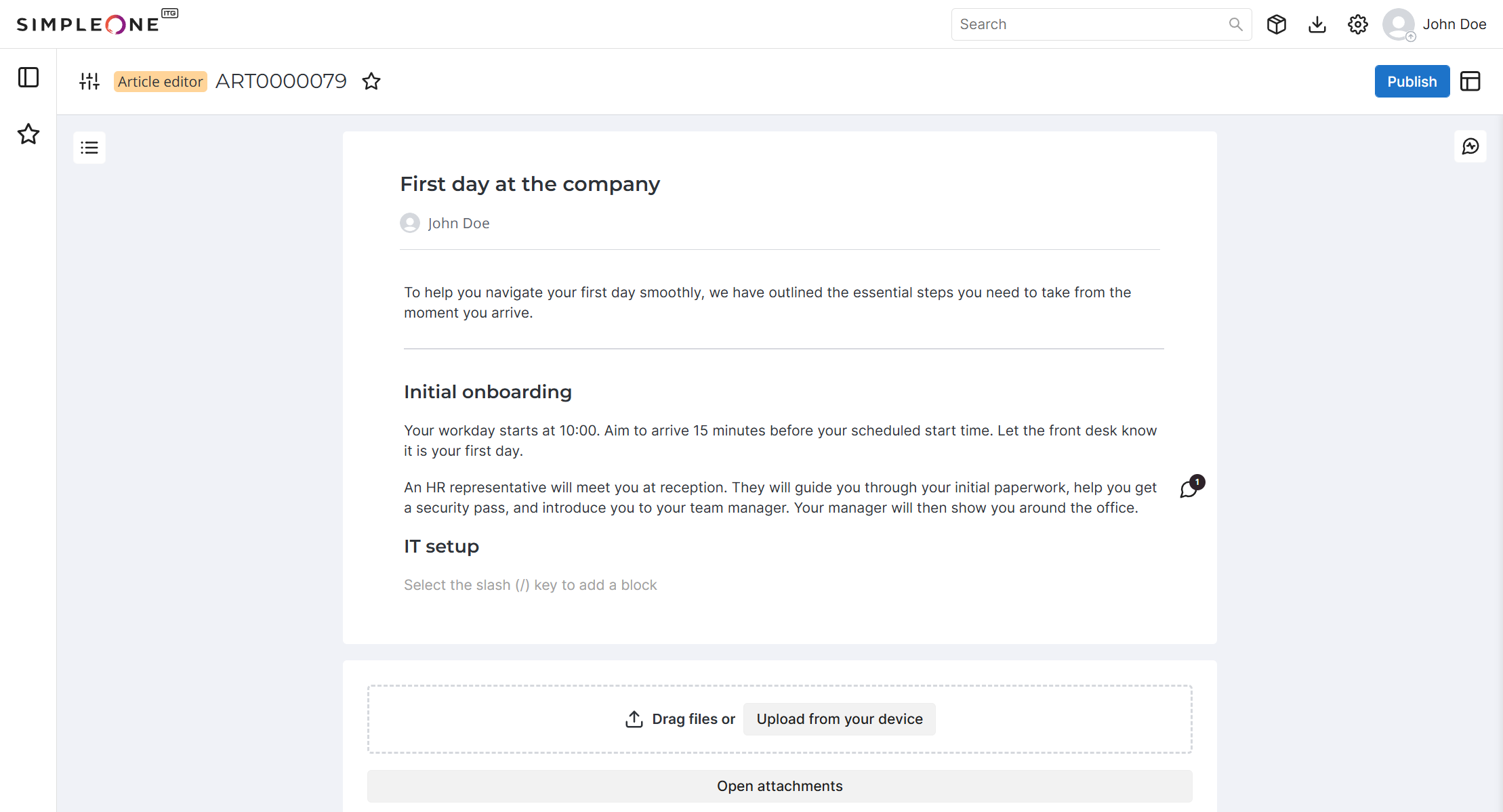
Create custom block types
Role required: admin.
You can create custom block types using script include. To do so, create a script record and add it to the record of a new article block type:
- Navigate to the Article Block Type (article_block_type) table.
- Click New.
- Complete the form fields.
- Click Save or Save and exit to apply the changes.
Then, the block is available in the article block editor.
Article Block Type form fields
| Field | Mandatory | Description |
|---|---|---|
| Name | Y | Specify the block name. |
| Input field type | N | Select the field type for data input. Available options:
|
| Script include | Y | Add a link to the record from the Script Include (sys_script_include) table that contains the configurations of the new block. |
You can only use inline styles (style="...") inside the markup.
Example 1. Hint
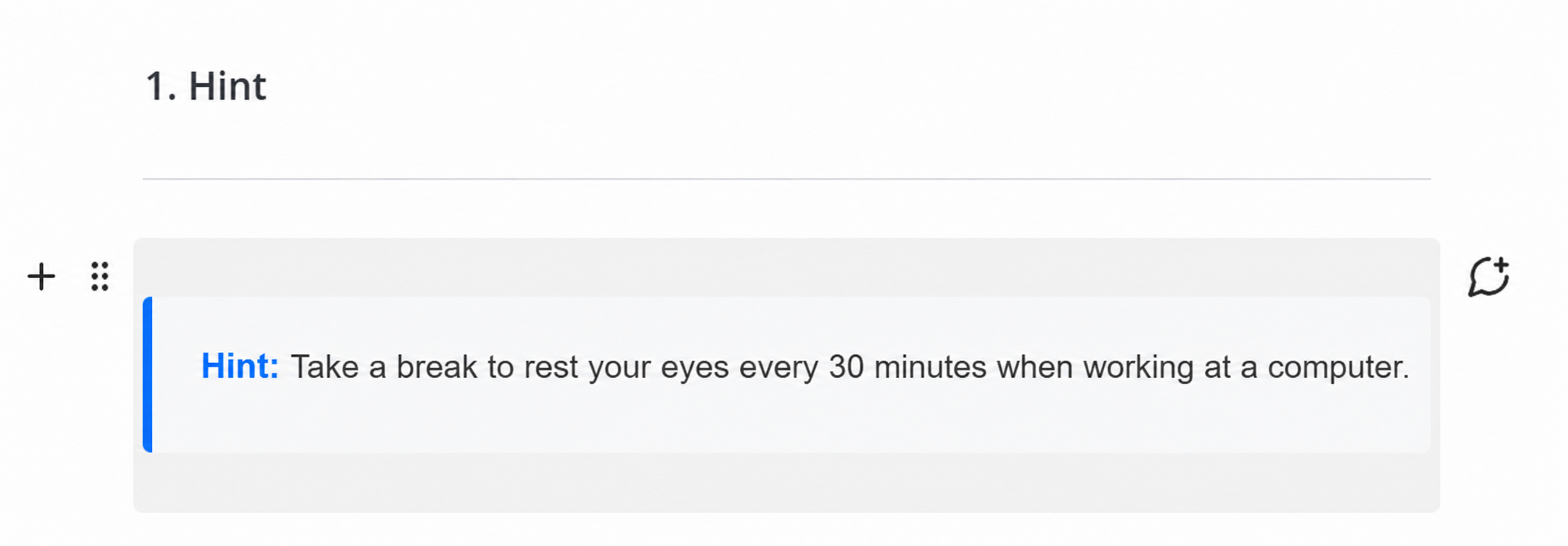
/**
 * Converts a Hint block value to its HTML representation.
 * @param {string} value - Escaping hint text.
 * @returns {string} - HTML string with the hint element.
 */

function convertHintToHtml(value) {
    return `
      <div style="margin: 20px 0; padding: 15px 20px; background-color: #f8f9fa; border-left: 4px solid #0d6efd; border-radius: 4px; font-family: sans-serif; font-size: 14px; line-height: 1.5; color: #333;">
        <strong style="color: #0d6efd;">Hint:</strong> ${value}.
      </div>
    `;
}
Example 2. Code
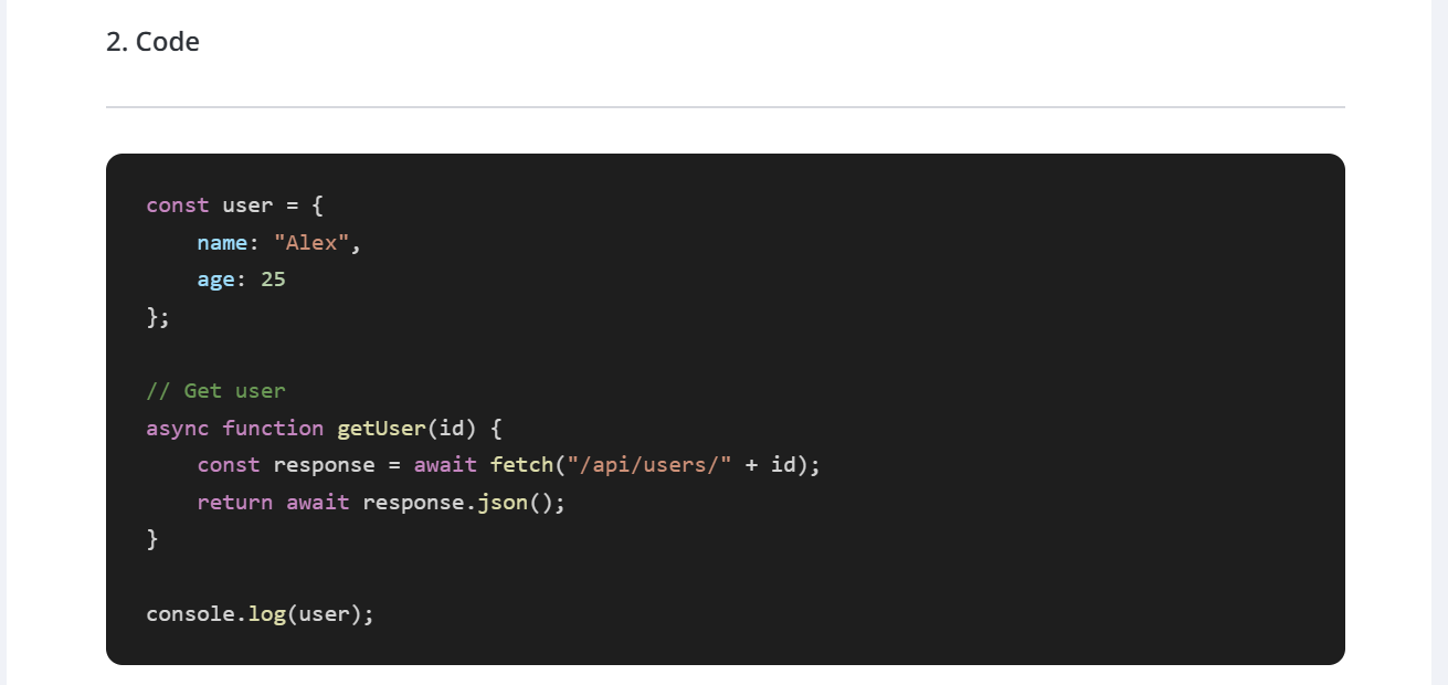
Script Include for code
/**
 * Converts JavaScript code to highlighted HTML.
 *
 * @param {string} js - JavaScript code.
 * @returns {string} - HTML string with highlighted JavaScript.
 */

function convertMarkdownToHtml(js) {
    js = js
        .replace(/
/g, '\n')
        .replace(/
/g, '\r')
        .replace(/	/g, '\t')
        .replace(/"/g, '"')
        .replace(/"/g, '"')
        .replace(/'/g, "'")
        .replace(/'/gi, "'")
        .replace(/'/g, "'")
        .replace(/&/g, '&');

    const styles = {
        keyword: 'color:#C586C0;',
        string: 'color:#CE9178;',
        number: 'color:#B5CEA8;',
        comment: 'color:#6A9955;',
        constant: 'color:#569CD6;',
        function: 'color:#DCDCAA;',
        property: 'color:#9CDCFE;',
        operator: 'color:#D4D4D4;'
    };

    const keywords = new Set([
        'const',
        'let',
        'var',

        'function',
        'return',

        'if',
        'else',

        'for',
        'while',
        'do',

        'switch',
        'case',
        'break',
        'continue',

        'new',

        'class',
        'extends',

        'import',
        'export',
        'from',
        'default',

        'async',
        'await',

        'try',
        'catch',
        'finally',

        'throw',

        'typeof',
        'instanceof',

        'in',
        'of',

        'this',
        'super',

        'delete',
        'void',

        'yield',

        'static',
        'get',
        'set'
    ]);

    const constants = new Set([
        'true',
        'false',
        'null',
        'undefined',
        'NaN'
    ]);

    const tokenRegex =
        /\/\/[^\n]*|\/\*[\s\S]*?\*\/|`(?:\\[\s\S]|[^`\\])*`|"(?:\\.|[^"\\])*"|'(?:\\.|[^'\\])*'|\b\d+(?:\.\d+)?\b|===|!==|==|!=|=>|<=|>=|\+\+|--|\+=|-=|\*=|\/=|&&|\|\||\?\?|\b[A-Za-z_$][\w$]*\b/g;

    let result = '';
    let lastIndex = 0;
    let match;

    while ((match = tokenRegex.exec(js)) !== null) {
        const start = match.index;
        const value = match[0];

        if (start > lastIndex) {
            result += js.slice(lastIndex, start);
        }

        const type = getTokenType(value, start);

        if (type) {
            result += `<span style="${styles[type]}">${value}</span>`;
        } else {
            result += value;
        }

        lastIndex = tokenRegex.lastIndex;
    }

    if (lastIndex < js.length) {
        result += js.slice(lastIndex);
    }

    return `<pre style="
        margin:0;
        padding:20px 24px;
        overflow:auto;
        background:#1E1E1E;
        color:#D4D4D4;
        border-radius:10px;
        font-family:ui-monospace,SFMono-Regular,Menlo,Monaco,Consolas,'Liberation Mono','Courier New',monospace;
        font-size:14px;
        line-height:1.6;
        tab-size:4;
        white-space:pre;
    "><code>${result}</code></pre>`;

    function getTokenType(value, position) {
        if (
            value.startsWith('//') ||
            value.startsWith('/*')
        ) {
            return 'comment';
        }

        if (
            value.startsWith('"') ||
            value.startsWith("'") ||
            value.startsWith('`')
        ) {
            return 'string';
        }

        if (/^\d/.test(value)) {
            return 'number';
        }

        if (constants.has(value)) {
            return 'constant';
        }

        if (keywords.has(value)) {
            return 'keyword';
        }

        if (
            /^(===|!==|==|!=|=>|<=|>=|\+\+|--|\+=|-=|\*=|\/=|&&|\|\||\?\?)$/.test(value)
        ) {
            return 'operator';
        }

        const before = js.slice(0, position);
        const after = js.slice(position + value.length);

        if (
            /\bfunction\s*$/.test(before)
        ) {
            return 'function';
        }

        if (
            /^\s*\(/.test(after)
        ) {
            return 'function';
        }

        if (
            /^\s*:/.test(after)
        ) {
            return 'property';
        }

        return null;
    }
}
Example 3. IFrame
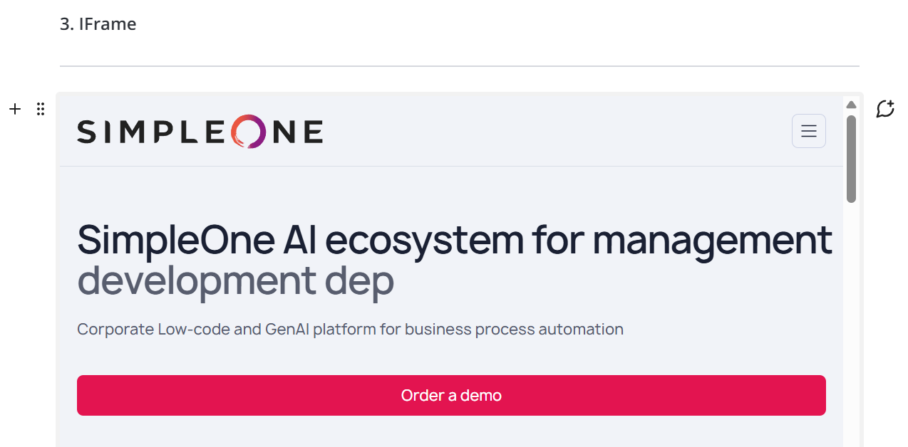
/**
 * Convert IFrame block value to HTML.
 * @param {string} value - a text link
 * @returns {string} - an HTML string with an IFrame element
 */

function convertIFrameToHtml(value) {
    return `<iframe src="${value}" style="width: 100%; height: 720px;"></iframe>`;
}
Actions on blocks
To edit a block, click it and make the required changes. Then, press Enter or anywhere outside the block to apply the changes.
You can freely move the blocks within the article to change their display order. To do so, move the pointer over the block you need to move and find the block menu icon . You can move the block in two ways:
- Click the icon and, holding it, drag and drop the block where needed.
- Click the icon without holding it to open the block menu. In the menu, select the required action: Move higher (inactive for the uppermost block) or Move lower (inactive for the lowermost block).
Using the menu , you can also Delete block. Note that a deleted block cannot be restored.
You can leave Comments on a block. To do so, complete the following steps:
- Move the pointer over a block and click the icon.
- On the Block activity panel that opens to the right, enter your message in the Comments field and click .
In the Article editor, the blocks that have comments are marked with the icon together with the comment counter. Click the icon to view the comments in the Block activity. You can also view the Block activity while editing the block by clicking the icon. Apart from comments, the Block activity also contains the History of block changes.
Actions on article
In the Article editor, you can:
- Open the settings to edit the article fields without going back to its form.
- In the editor, you can only change the article's State using the Publish and (Unpublish) buttons.
- Add the article to favorites to be able to open it directly via the navigation menu. You can then remove the article from favorites by clicking the icon once more.
- Use heading navigation. Click the icon in the upper-left corner of the editor, and then select the heading you need to navigate to on the Article navigation panel that opens to the left.
- View the Article activity – its History of changes, as well as any Comments left.
- Go back to the article form .
- Add, view, and delete attachments.
Click Publish in the upper-right corner of the editor to make the article available on the portal. The article state will change to Published.
You can edit the article after publishing it. Make the necessary changes and click Publish changes in the upper-right corner of the editor to update the article on the portal.
To unpublish the article, click . The article will move to the Unpublished state. If needed, you can then Publish this article once more.
HTML
To create an article in the HTML format, perform the following steps:
- Navigate to Knowledge Base → All articles or My articles.
- Click New on the list view. You can also open an existing article's form and click New there.
- Fill in the article fields. In the Format field, select HTML.
- Click Save.
In the Content field, you can add formattable text and images both in the visual editor and via the source code.
To display the created article on the portal, change its State to Published. You can hide a published article from the portal by changing its state to Unpublished.
Article form fields
| Field | Mandatory | Description |
|---|---|---|
| Number | Y | This field is populated automatically and has the ART0000000 format. |
| Name | Y | Specify a name for the article. |
| Product | N | Select a product the article is related to. |
| Product modules | N | Select the product modules the article is related to. This field gets cleared if the Product is changed or cleared. |
| Content DB | Y | Specify the content database this article is related to. |
| KB category | Y | Specify the knowledge base category this article will be displayed in on the portal. |
| Content item class | Y | Specify the class of the article. For example:
See the Create a content item class section to learn more. |
| Object category | N | This field defines access to the category according to the content item class selected. If the content item class is external, the category will also be external. This field is populated automatically after specifying the Content item class field value. Available options:
|
| Updated by | N | This field is automatically completed with the name of the user who made the most recent changes to the article. |
| Format | N | Select the article format. Available options:
|
| Content | N | Add the article's contents. The field is displayed only if the HTML format is selected. |
| Work notes | N | Add comments for this article. For Blocks-type articles, apart from the Activity Feed on the form, these comments will be displayed on the Article activity panel in the Activity editor. |
| State | N | The state of the article. Available options:
The Draft and Unpublished states are unavailable for an article if it is the only published article of the SLA or Service description type for the external specification, or the only published article for the internal specification. |
| Service | N | Select a service the article is related to. If you remove the reference to a service from the field, the reference to the article is removed from the service record as well. |
| Owned by | N | The field is automatically filled in with the owner of the selected service. |
| Responsible group | Y/N | Specify the group responsible for the article. This field is non-mandatory if the Responsible person is specified. |
| Responsible person | Y/N | Specify the person responsible for the article. This field is non-mandatory if the Responsible group is specified. |
| Metainfo | N | Fill in the field with the metadata. |
| Created by | N | The field is automatically completed with the name of the user who created the article. |
You can add Related incidents, Related changes, and Related problems fields to the form to view the ITSM records related to the article. See the Form Layout article to learn more.
The article form has the Activity Feed displaying the History of changes made to the article, as well as its Work notes (Comments in the Article editor).