Page Structure
The page structure contains various types of elements linked with each other. This allows you to build flexible and configurable pages.
The diagram below illustrates a typical page structure.
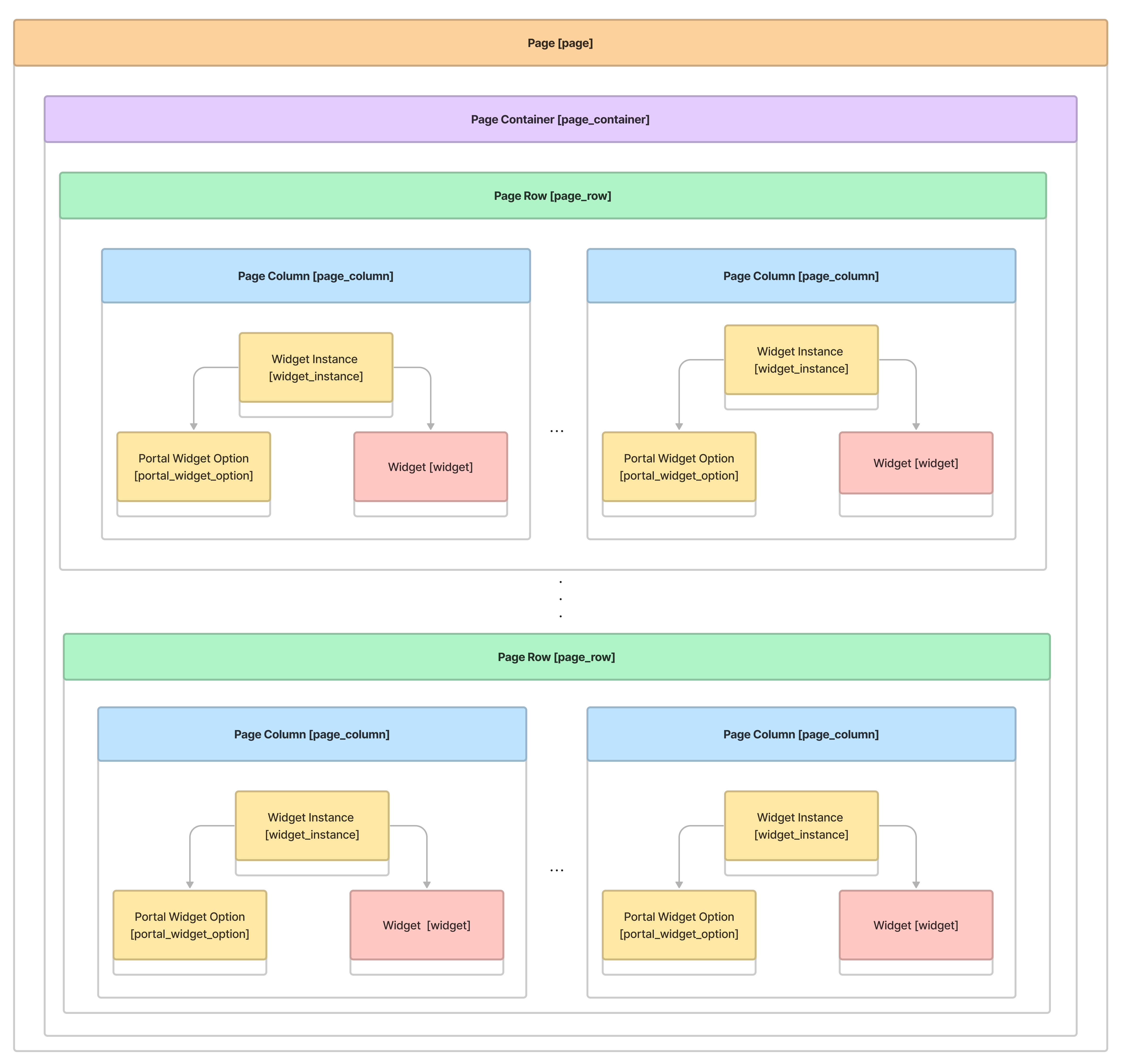
For more clarity, the following table contains a brief glossary.
| Term | Description |
|---|---|
| Page | A portal page is an entity containing the page structure. Create as many pages as you need to implement your portal logic. |
| Page Container | Page container allows building the structural view of a single page with columns and rows. |
| Page Row | Containers are proportionally divided into customizable rows. For more information, refer to the Page Rows section of this article. |
| Page Column | Rows are proportionally divided into customizable columns. For more information, refer to the Page Columns section of this article. |
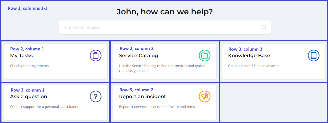
The following screenshot explains the rows and columns concept.
Create and configure a page
To create and configure a page, follow the instructions below:
- Create a page.
- Create a page container.
- Create a page row.
- Create a page column.
- Add system interaction elements.
- Create a widget instance.
- Create a widget option.
It is highly recommended to create page components from the Related Lists area of the objects instead of creating from scratch. For example, after creating a page, you can create a related container for this page right away.
Create a page
The page is a template for other pages that should be carefully configured.
To create a page template, complete the steps below:
- Navigate to Portal Structure → Pages.
- Click New and fill in the fields.
- Click Save or Save and exit to apply the changes.
When filling in the Path name field, keep in mind that this is the URL suffix of your future page, so fill in this field carefully.
Pages form fields
- General
- Options
- Styles
| Field | Mandatory | Description |
|---|---|---|
| Path name | Y | Specify a suffix to be used in the URL. For example, if you type The value should be unique within the portal, but it can be used when configuring other portals. |
| Title | N | Specify a page title. |
| Description | N | Type a description of the page. |
This tab is responsible for the page template configuration.
| Field | Mandatory | Description |
|---|---|---|
| Dynamic link name | N | Define a page title to use in the breadcrumbs and the sidebar menu. |
| Dynamic page title | N | Specify a title to display on the page form. |
| Active | N | Select the checkbox to make the page active or inactive. When it is active, you can use the page for portal needs. |
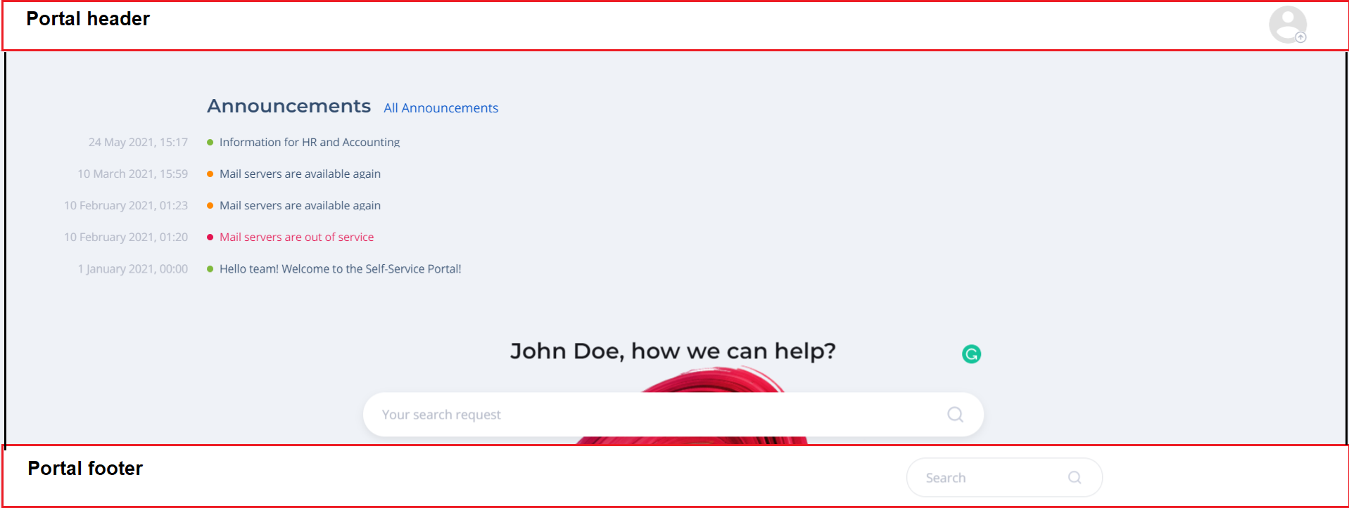
| Public | N | Select the checkbox to make the page visible for unauthorized users. When the checkbox is selected, the page is available for public access, so use it with caution. |
| Use for home page | N | Select the checkbox to use the page as the home page, a page you want users to see when they sign in. |
| Use portal header | N | Select the checkbox to use the page as the portal header. |
| Use portal footer | N | Select the checkbox to use the page as the portal footer. |
This tab is responsible for page customization.
| Field | Mandatory | Description |
|---|---|---|
| SCSS Variables | N | Define the page-specific SCSS variable to customize the page. The defined variables override variables defined on the portal level (in the SCSS variables field of the Portal table). |
| SCSS Styles | N | Define the page-specific SCSS styles to customize the page. The entered styles to override styles defined on the portal level (in the Portal table's SCSS styles field). |
| Background Image | N | Attach an image to use as the background for your page. The maximum size of the image is 20 Mb. |
| Background Color | N | Select the page background color. These colors are preconfigured and stored in the Colors (sys_color) table. Contact the vendor to add a custom color that is not included in the Color (sys_color) table. |
Create a page container
A page container is the main structural page unit. After creating, split the container with columns and rows.
To create a page container, complete the steps below:
- Open the page created earlier for which you need to create a container.
- In the Related Lists area, select the Page Container tab.
- Click New and fill in the fields.
- Click Save or Save and exit to apply the changes.
To obtain the available containers list, navigate to Portal Structure → Page Containers. You can also create a page container from scratch there.
Page Container form fields
| Field | Mandatory | Description |
|---|---|---|
| Name | N | Specify a container name. |
| Page | N | Specify a page that will contain the container. |
| CSS class names | N | Specify the CSS classes for the container. Defined classes override classes for the page or the portal. |
| Background image | N | Attach an image to use as the background for your container. The maximum size of the image is 20 Mb. |
| Background color | N | Select the container background color. These colors are preconfigured and stored in the Colors (sys_color) table. Contact the vendor to add a custom color that is not included in the Color (sys_color) dictionary. |
| Active | N | Select the checkbox to make a container active or inactive. |
| Fixed width | N | Select the checkbox to fix the container padding. |
| Order | N | Enter a number that will define the container order in a template. Items are sorted in ascending order. |
Create a page row
A page container can be divided into rows, which, in turn, can be divided into columns.
To create a page row, complete the steps below:
- Open the page container for which you need to create a row.
- In the Related Lists area, select the Page Row tab.
- Click New and fill in the fields.
- Click Save or Save and exit to apply the changes.
To obtain the available page rows list, navigate to Portal Structure → Page Rows. You can also create a page row from scratch there.
Page Row form fields
| Field | Mandatory | Description |
|---|---|---|
| Page Сontainer | N | Specify a page container for this row. |
| CSS Class Names | N | Specify the CSS class names to customize the elements view located on this row. Classes defined there override classes defined for the page, the portal, or the container. |
| Active | N | Select this checkbox to make a row active or inactive. |
| Order | N | Enter a number that will define the row order on a page. Rows are sorted in ascending order. |
Create a page column
A page row can be divided into 12 columns max.
To create page columns, complete the steps below:
- Open the page row for which you need to create a column.
- In the Related Lists area, select the Page Column tab.
- Click New and fill in the fields.
- Click Save or Save and exit to apply the changes.
To obtain the available page columns list, navigate to Portal Structure → Page Columns. You can also create a page column from scratch there.
Page Column form fields
| Field | Mandatory | Description |
|---|---|---|
| Page row | N | Specify a previously created row for the column. |
| CSS class names | N | Specify the CSS class names to customize the elements view located on this row. Classes defined there override classes defined for the page, the portal, the container, or the row. |
| Extra-small devices | N | Enter a number from 0 to 12 that will define the width of the column. The parameter is responsible for the view in browsers on extra small devices (on phones less than 768px). For example, if there are two columns in a row with width values 4 and 8, respectively, then the width of one of them is equal to 1/3 of a page, and another one’s width is equal to 2/3 of that page. |
| Small devices | N | Enter a number from 0 to 12 that will define the width of the column. The parameter is responsible for portal view in browsers on small devices (on tablets 768px and up). |
| Medium devices | N | Enter a number from 0 to 12 that will define the width of the column. The parameter is responsible for portal view in browsers on medium-size devices (on desktops 992px and up). |
| Large devices | N | Enter a number from 0 to 12 that will define the width of the column. The parameter is responsible for portal view in browsers on large devices (on large desktops 1200px and up). |
| Active | N | Select the checkbox to make this column active or inactive. |
| Order | N | Enter a number that will define the column order in a row. Columns are sorted in ascending order. |
Configure a page layout
To implement a responsive page layout, complete the steps below:
- Create a container within a page. Within a page, containers are placed in descending order based on the Created at field value and can be sorted by the Order field in the Container record form.
- Create rows within the container. Rows are container parts available for keeping the content items. They are placed in descending order based on the value of the Order field in the Row record form. The row can be divided into maximum 12 columns.
- Create columns in which you can place your widgets implementing portal logic.
- Define column width based on the Bootstrap grid system. You can specify a number defining how much row volume can this column take.
If the width is not specified, then the column takes up all the row width available (the same behavior as if the max value 12 was specified). If more than one column is used and the width is not specified, then the columns share the row space equally.
For example, you create a row with 2 columns in it. Your desired display conditions are as follows:
| Device class | Display condition |
|---|---|
| Desktop | Columns and content in them should be of equal width. |
| Phones | Column 1 should take up 2/3 of the screen, column 2 should take up the rest. |
| Small laptops | Column 1 should take up 1/3 of the screen, column 2 should take up the rest. |
| Tablets | Column 1 should take up 1/3 of the screen, column 2 should take up the rest. |
Implementation
Specify values in the Large devices, Medium devices, Small devices and Extra-small devices fields for the Column record forms as shown below:
| Large devices (lg size) | Medium devices (md size) | Small devices (sm size) | Extra-small devices (xs size) | |
|---|---|---|---|---|
| Column 1 | 6 | 4 | 4 | 8 |
| Column 2 | 6 | 8 | 8 | 4 |
"12" is the maximum multiplier value for all columns in a row. In other words, the column multiplier sum (if there are more than one column in a row) cannot exceed 12. For example, three columns can have multipliers (4,4,4), or (5,5,2), or any other combination that is 12 in sum.
If the multipliers sum exceeds 12, the column moves to the new line.
Widgets
To make a page more interactive, use Widgets. It is a small interactive application containing the server and client logics. It sends, receives, and processes events through the client and server controllers. SimpleOne widgets can be added to forms as well as to pages.
In the out-of-the-box platform delivery, you can find a number of preconfigured widgets available in the Widgets table. To get acquainted with them, navigate to Portal Structure → Widgets.
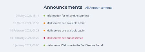
As an example, we can consider one of the widgets delivered – Main Announcement Widget. This widget is based on the <previewList> portal tag and implements announcements list on the Service portal main page.
Create a widget instance
To place a widget on a portal page, use Widget Instances. These elements help to define a specific location for the widget according to the column specified and to customize the widget options with the option schema.
To create a widget instance, complete the steps below:
- Open the page column for which you need to create a widget instance.
- In the Related Lists area, select the Widget Instance tab.
- Click New and fill in the fields.
- Click Save or Save and exit to apply the changes.
To obtain the available widget instances list, navigate to Portal Structure → Widget Instances. You can also create a widget instance from scratch there.
Widget Instances form fields
| Field | Mandatory | Description |
|---|---|---|
| Widget | N | Specify a widget configured earlier. Select it from the Widget (sys_widget) dictionary. |
| Page Column ID | N | Specify an ID of the column on some page for applying these settings. |
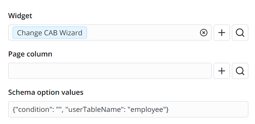
| Schema Option Values | N | The field allows changing some output data for specified widgets. Specify clarifying options in JSON format. The following example shows the empty selection performed for the Employee table.
|
| Active | N | Select the checkbox to make this widget instance active or inactive. |
| Public | N | Select the checkbox to make this page visible for unauthorized users. When this checkbox is selected, the page is available for public access, so use it with caution. |
| Order | N | Specify the order of the widget location in a page column. Fill in this field with the integer number to display widgets by increasing the field value. When displaying a single widget in a column, the order value is irrelevant. |
Create a portal widget option
A portal widget option defines, for example, logic differences for similar widgets, narrows down the selection criteria, and solves other related tasks.
To create a widget option, complete the steps below:
- Open the widget instance for which you need to create a widget option.
- In the Related Lists area, select the Portal Widget Option tab.
- Click New and fill in the fields.
- Click Save or Save and exit to apply the changes.
To obtain the available widget options list, navigate to Portal Structure → Widget Options. You can also create a widget option from scratch there.
Widget Options form fields
| Field | Mandatory | Description |
|---|---|---|
| Portal | N | Select a previously created portal record from the list. |
| Widget instance | N | Select a previously created widget instance from the list to bind options. |
| Schema option values | N | Specify widget instance options in JSON format. These options allow for transmitting values of the variables defined in the widget body for different contexts (different widget instances). |
After you have defined these options as described above, they are available in the options global object. For example, the options specified in the Widget Options:
Option Schema Values
{
  "itemView": "SP%20View%20Only",
  "tsGroupId": "158983234712988195"
}
should be used in a Template this way:
Template
<search tsGroupId=options.tsGroupId searchQuery="{data.search}"
  onChange="s_widget_custom.search(arguments[0]);"
  searchUrl="/portal/search_result" showTitle="true" size="lg"
  placeholder={data.placeholderMessage} itemPage ="record" itemView=options.itemView>