form
The <form> tag is a widget displaying a record form when necessary parameters (such as the table, form view, and record ID) are specified. It allows users to interact with the record form, while maintaining the usual form behavior. It also supports the functionality of widgets added to the form.
Structure
This widget includes the following elements:
- The embedded widget that contains the form elements.
- The header block:
- A header can be taken from the column with the Display by ref checkbox selected.
- The section block:
- The Default section should be the first in the section list if there is more than one.
- Every widget section is linked to the corresponding form section and has its own title.
- This block is mandatory. The footer block that contains UI actions (buttons and others).
Elements
Form widget elements, such as form elements, can be of different types. The widget supports functionality of all field types used in forms (such as properties, behavior, scalar type, and others).
- Widget elements display date and time in the user timezone.
- The widget elements that contain the Translated Text field type (such as table and column titles, choice options) display the values in the current user's locale.
Attributes
To create a dynamic form, use the following attributes:
| Attribute | Type | Mandatory | Description |
|---|---|---|---|
| class | String | N | Specify the CSS class name defined in the CSS field of the widget. |
| name | String | N | This attribute stores the form name. Define the form name in the Template field. Then, call it in the widget client script. |
| tableName | String | Y | Specify the table name. |
| view | String | N | Define a view name of the table, for example, Default. |
| save | String | N | Add a Save button on the form with the customized text (see the code example below). Use this attribute when it is impossible to use the UI actions due to any reasons (the uiActions attribute is set to false). |
| titleHide | Boolean | N | Set the value to true to display the form header by default. The default value is false. |
| uiActions | Boolean | N | Set the value to true to make UI actions available to use. Otherwise, their usage is prohibited (except for the Save button specified by the save attribute). |
| userScripts | Boolean | N | Set the value to false to disable the client scripts of the selected table. The default value is true. |
| sysid | String | N | Specify the ID of the table record. The table should be specified first via the tableName attribute. If the sysid attribute is not set, a new record form is displayed. |
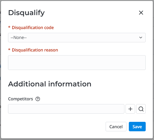
Example:
<form
    name="leadForm"
    tableName="crm_leads"
    view="Modal Form Disqualify"
    uiActions="false"
    userScripts="true"
></form>
<div class="buttonsModalQualify">
    <button
        buttonType="unstyled"
        event-click="window.s_widget_custom.cancel()"
    >{data.cancel}</button>
    <button
        disabled="{data.isDisabled}"
        buttonType="primary"
        event-click="window.s_widget_custom.save()"
    >{data.save}</button>
</div>
The template above displays the following element on the page:
IndicatePresence
Use the <IndicatePresence> tag with the <Form> tag to add the presence indication widget to a form.
To display the widget, the Indicate presence checkbox must be selected on the table form (the indicate_presence attribute is true).
Available attributes:
| Attribute | Type | Mandatory | Description |
|---|---|---|---|
| tableName | String | Y | Specify the table name. This value must be the same as the value of the tableName attribute of the <Form> tag. |
| recordId | String | Y | Specify the ID of the record. This value must be the same as the value of the sysid attribute of the <Form> tag. |
Example:
<IndicatePresence tableName="{data.table_name}" recordId="{data.record_id}"></IndicatePresence>
The code above displays the following element on the page: