Form Layout
In SimpleOne, forms display table records along with the information stored as column values. Form fields of various types are intended to display this data on forms and allow users to interact with it.
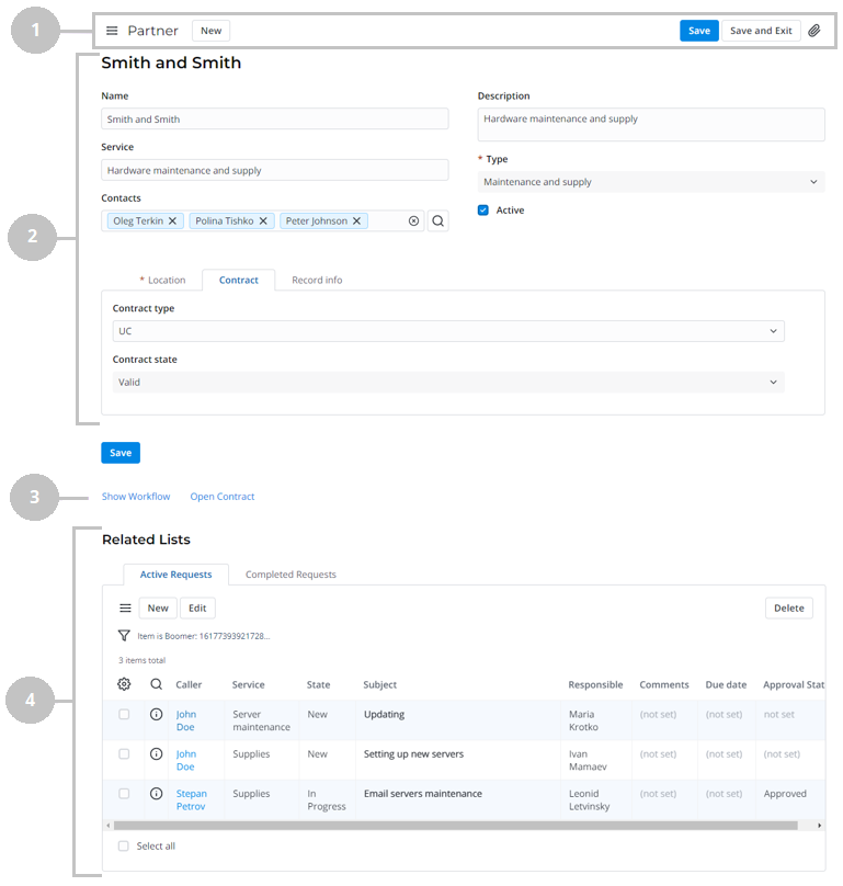
Record form
A record form consists of the following parts:
- Header area – contains the name of the table, the burger menu , the available user interface actions, and the presence indicator.
- Main area – contains the record title and the record fields. The Default section is displayed first.
- Related Links area – contains user interface actions in the form of links.
- Related Lists area – contains the lists of records from the tables connected with the current one.
Compact view
You can enable the Compact view in your Preferences.
The compact view allows you to display more information on the screen. To achieve this, form fields have smaller labels and less padding.
Access to records
If you do not have access rights to view some records, reference fields display the following badges:
- If a field refers to a record unavailable to you, a gray badge with the unavailable data text is displayed. You can remove the record from the field by clicking to the right of the badge, but you cannot navigate to its form.
- If an ACL rule restricts access to the Display Name of a record, then a blue badge with the unavailable title text is displayed. You can remove the record from the field by clicking to the right of the badge and navigate to its form via the pop-up window.
- If the referenced record is deleted, the field will display a gray badge with the record not found text. You can remove the record from the field by clicking to the right of the badge.
If a deleted column is selected in the field, the Column not found placeholder is displayed. Under the field, the following hint is displayed: The record is not found, select another one.
When you do not have access to some records in the Related Lists area, the following message is displayed: Some entries are hidden by security policy.
Configure the presence indication
The presence indicator appears when other users interact with the same record as the current user. It displays the number of users currently interacting with the record. If only the current user interacts with the record, the presence indicator is hidden.

To enable the presence indicator for a table, select the Indicate presence checkbox when creating or configuring it and add the IndicatePresence widget to the form layout.
When clicked, the indicator shows the dropdown list of users that currently interact with the record.
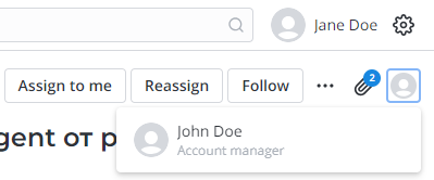
By default, the profile picture, name and an optional line, containing the user's job title, are displayed in the dropdown list. To change the information displayed in the optional line or hide it, edit the simple.presence_indication.additional_info_column_name system property.
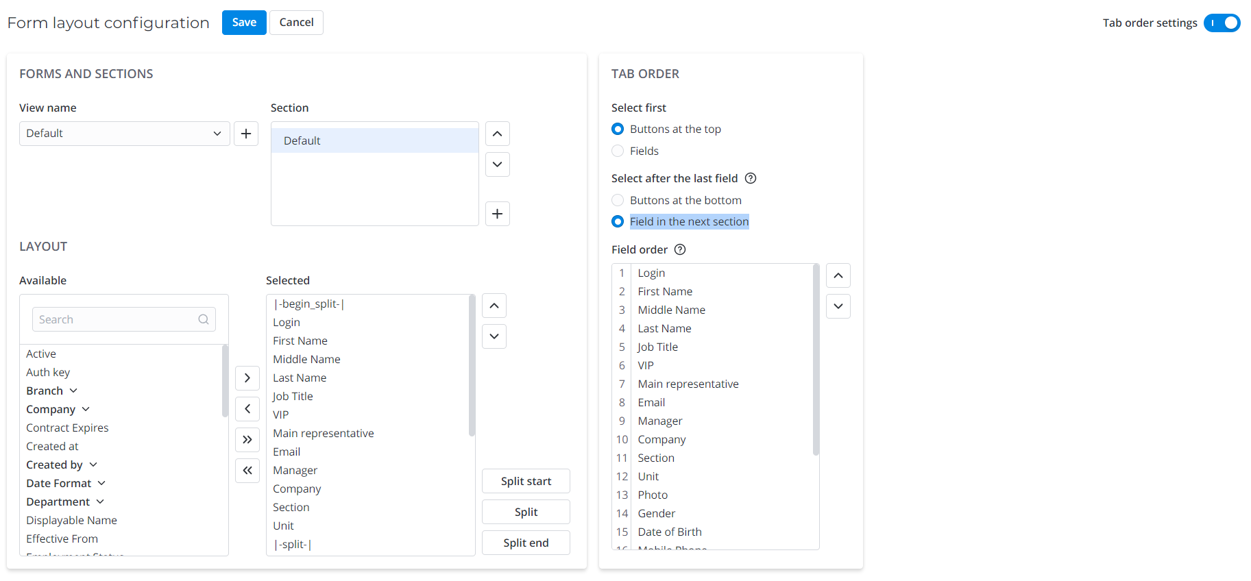
Configure a form layout
You can change the form views by configuring form layouts. Separate form views with sets of fields and widgets are useful for users with different roles who process various tasks.
Use client scripts to dynamically change form field visibility, depending on user roles, fields state, or form state (inserting/updating).
Every SimpleOne system table has a Default form view that administrators can configure using the form layout features.
To change a form layout, follow the steps below:
- On the record form, in the burger menu , select Configure → Form → Layout to open the Form layout configure menu.
- In the Form view and section area, the View name displays the view you opened this menu from. If you need to change another form view, select it in this field.
- Configure your form view with the following actions:
- Configure a set of fields in sections.
- Add new form sections.
- Split sections into vertical columns.
- Configure the checkbox position for True/False fields.
- Configure the Tab order (the order of fields and other elements focused using the keyboard by pressing the Tab key).
- Click Save.
You can create separate form views with sets of fields for different processes or user roles. The system stores all the list and form views created along with their layout elements as table records. See Form Elements to learn more.
Create a form view
To create a separate view, complete the steps below:
-
On the record form, in the burger menu , select Configure → Form → Layout to open the Form layout configure menu.
-
In the Form view and section area, click Add new next to the View name field.
-
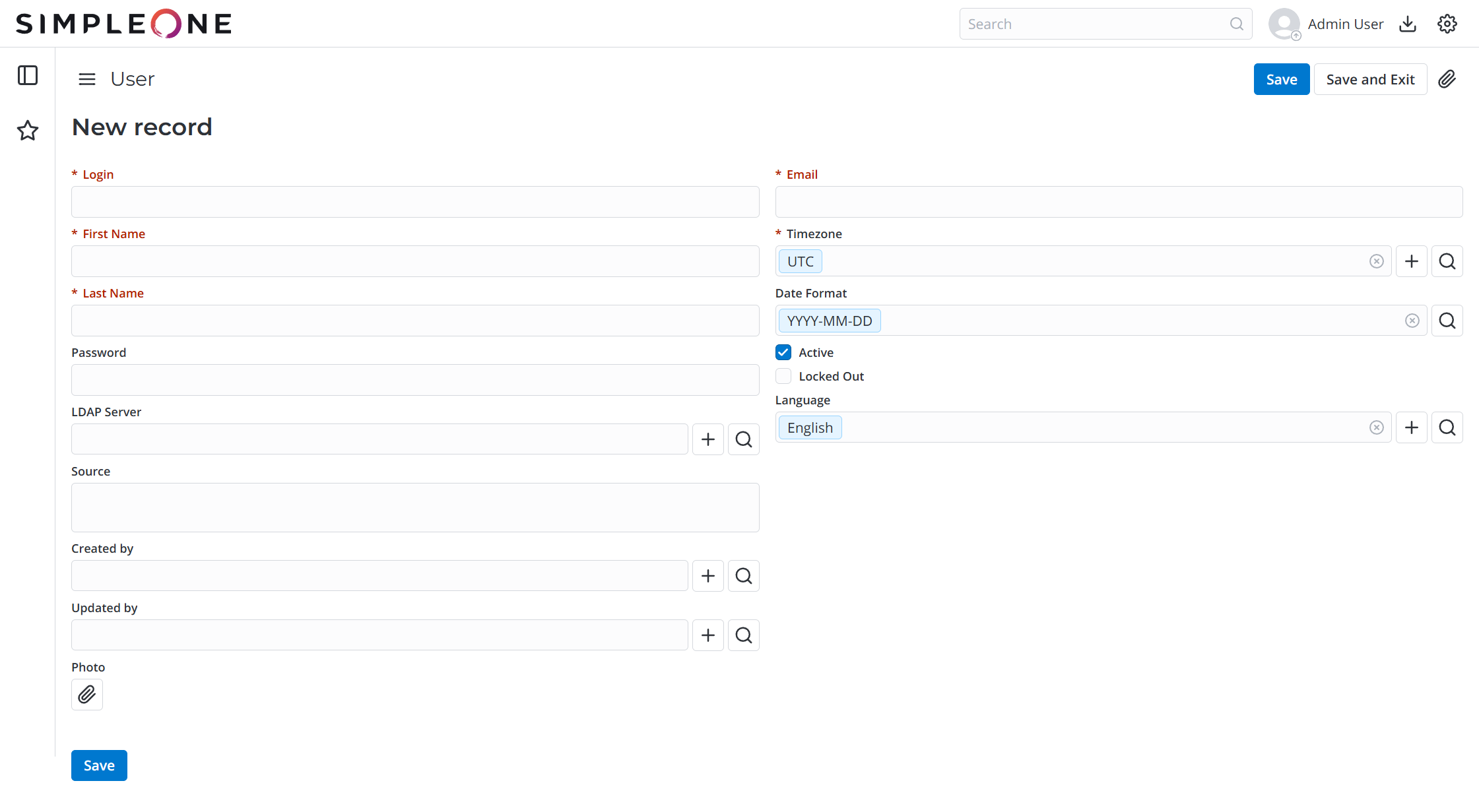
In the modal window that appears, enter the desired view name and click Create. Note that the Preview view name is reserved for the record preview form. For example, you have created a Preview form for the Timezone table and configured the fields for it. If you click the field referencing the Timezone table on other forms (for example, User, Employee, Schedule, and so on), the timezone record Preview form appears.

-
Configure the fields to display by moving them from the Available box to the Selected box.
-
(optional) Use the Section option to add more form sections by clicking .
-
(optional) Configure the tab order.
-
Click Save to apply the changes.
- By default, a new form view contains no fields or widgets. Add the elements you need from the Available box.
- Note that the Preview view name is reserved for the record preview form. This form looks the following way.
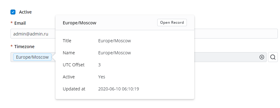
Example
You have created a Preview form for the Timezone table and added some fields like shown in the screenshot above (these are the Title, Name, UTC offset, Active, and Updated at fields). If you click the field referencing the Timezone table on other forms (for example, User, Employee, Schedule, and so on), the timezone record Preview form appears.
Configure a form section
With sections, you can logically and visually separate the fields on the form.
The Default section displays the table fields grouped on the main area of the form. Custom sections display a set of fields on separate tabs at the bottom of the form above the Related Lists.
Configure the table fields available on the form in the Layout area. The Available box contains all table fields that can be embedded in the form by adding them to the Selected box. Move elements by dragging them or using the and buttons.
- To remove or add all the fields, click the or button.
- To move several elements in a row, select them with the Shift key pressed and drag them from the Available layout area to the Selected one.
- To move several scattered elements at once, select them with the Ctrl key pressed and drag them from the Available layout area to the Selected one.
Create a section
To create a section and fill it with fields, follow the steps below:
-
On the record form, in the burger menu , select Configure → Form → Layout to open the Form layout configure menu.
-
In the Form view and section area, click Add new next to the Section field.
-
In the modal window that appears, enter the section name and click Create.

-
With the created section selected, configure the fields to display by moving them from the Available box to the Selected box.
-
Click Save to apply the changes.
Positioning the sections
You can change sections order by dragging them in the Section menu or clicking the and buttons.
Split section fields
You can configure how fields and widgets are placed on the form. See the Add Widget to Form article to learn how to add widgets.
By default, they go from top to bottom in one column. Begin split and End split are not necessary for a form layout organized in one column. If you need to rearrange them in two or more columns, you can use splits.
To split the fields into columns, follow the steps below:
- Click Begin split to add the |-begin-split-| element to the Selected box. Move this element to specify where the split area starts.
- Click End split to add the |-end-split-| element to the Selected box. Move this element to specify where the split area ends.
- Click Split to add the |-split-| element to the Selected box. Move this element between |-begin-split-| and |-end-split-| to set the place where a column ends.
- (Optional) Add more |-split-| elements in the area between |-begin-split-| and |-end-split-|, if you want to rearrange form fields in more than two columns.
- (Optional) Add more sets of |-begin-split-|, |-split-|, and |-end-split-| elements within the existing ones to create a nested splitting. For this, put the elements between the existing |-begin-split-| and |-end-split-|. These splits create subcolumns within a column. The number of nested splittings is unlimited.
- Click Save to apply the changes.
If you omit the |-begin-split-| element, all fields above the |-split-| element will be considered the rightmost column in the Selected box (as if there is a |-begin-split-| element above them).
Note that the |-begin-split-| element is obligatory for nested splittings.
The splitters appear at the bottom of the Selected box if no fields are highlighted. If a field is highlighted, the split element appears right after it.
Drag them or using the and buttons to move these splitter elements.
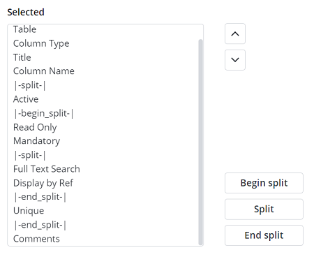
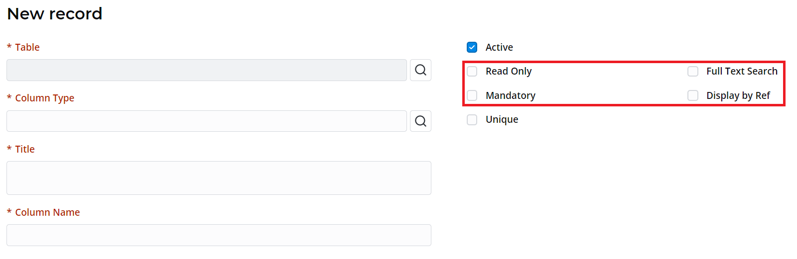
In the example below, the form is divided into two columns:
- Table, Column type, Title, Column name
- Active, Read only, Mandatory, Full text search, Display by ref, Unique
Within the second column there is a nested splitting with two columns:
- Read only, Mandatory
- Full text search, Display by ref
Configure the checkbox position
True/False field checkboxes can be positioned:
- to the left of the field label (set by default).
- below the field label.
To configure the checkbox position for a True/False field, follow these steps:
-
Move the pointer over the field's name in the Selected box.
-
Click the gear icon next to the field's name.
-
In the modal window that appears, select the required checkbox position and click Save.
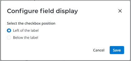
-
Click Save on the Form layout configuration page to apply the changes.
The checkbox position you have selected will apply to the compact view as well.
Configure the tab order
You can configure the order of fields and other elements focused using the keyboard (usually, by pressing the Tab key). Turn on the Tab order settings toggle to display the Tab order area. There you can configure the the focus order of elements separately for each section. After focusing the last element, the first one is focused again.
Use the following keyboard shortcuts to switch between the form sections:
- Alt + S + Right arrow to move to the next section.
- Alt + S + Left arrow to move to the previous section.
When you reach the last section of the form and try to move on to the next one, the first one is opened. If you move back from the first section, the last one is opened.
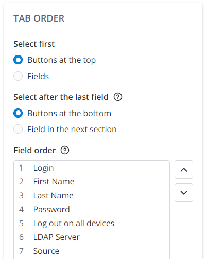
- Select first – specify the element type to start focusing. Available options: Buttons at the top, Fields.
- Select after the last field – specify the element type to to focus on after the last field. Available options: Buttons at the bottom, Field in the next section.
- Field order – configure the focus order of the fields using the keyboard. Use the and buttons or drag the field titles in the Field order list. Use the and buttons located to the left of the field title to disable or enable field focus. Click to restore the default tab order. Use the following keys to speed up the configuration process:
- To drag multiple fields, hold the Ctrl key, select the necessary elements and move them to where you need.
- Select a field in the list with the cursor, hold the Shift button to select several elements in a row, and click the field that will be the last in the selection. By default, the tab order is identical to the field order.
The new fields added to the section are marked with a red dot in the Field order box:

Configure a complex form layout
In the following example, a complex form layout is created. Dashed lines in the screenshots below represent the |-split-| element.
Basic layout structure is the following:
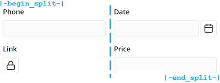
|-begin_split-|
Phone
Link
|-split-|
Date
Price
|-end_split-|
You can create unlimited number of columns or divide columns within other columns as in the picture below. A complex form layout is divided into component parts. You can use this scheme to create your own complex layout.
Complex layout example
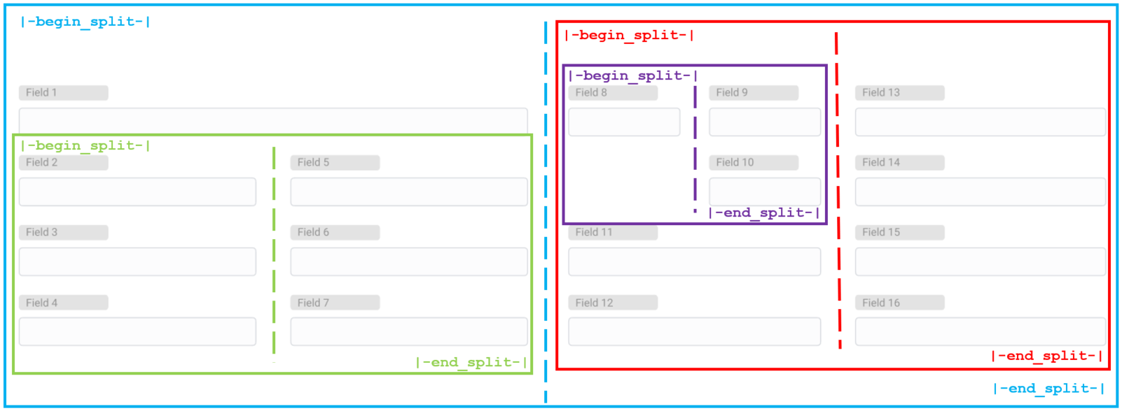
The form consists of four field groups: Blue, Red, Green, and Purple.
The Blue group divides the form layout into 2 general columns. This is the basis of the form layout.
The left column is partially divided into 2 columns by the Green group.
The right one is divided into 2 columns by the Red group.
The left column of the Red group is partially divided into 2 columns by the Purple group.
To recreate this form, perform the following steps:
- Blue group:
- Define edges of the fields group using the |-begin_split-| and |-end_split-| elements.
- Put the |-split-| element between fields.
- Green group:
- Define edges so that the |-end_split-| element goes before the |-split-| element of the Blue group.
- Put the |-split-| element between fields.
- Red group:
- Define edges so that the |-begin_split-| element goes after the |-split-| element of the Blue group.
- Put the |-split-| element between fields.
- Purple group:
- Define edges so that the |-begin_split-| element goes after the |-begin_split-| element of the Red group and the |-end_split-| goes before the |-split-| element of the Red group.
- Put the |-split-| element between fields.
Configure the Related List area
Related Lists appear at the bottom of forms and show records in tables that have relationships with the current record. For example, on the User form, related lists can display User Role lists. See the Related Lists article to learn how to add them to the layout.
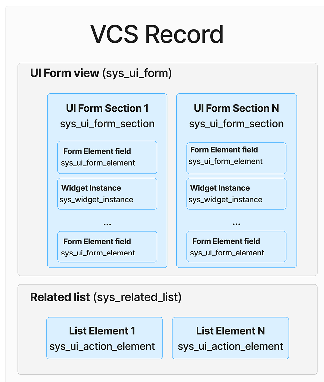
Form view of a VCS record
The VCS record form aggregates all the elements of the form related to it: UI Form Element (sys_ui_form_element), Form Section (sys_ui_form_section), Related List (sys_ui_related_list), and Related List Element (sys_ui_related_list_element). They are stored in the JSON (copy) field.
See a scheme content of a VCS record below:
A JSON (copy) field stores the data about all the related elements in the following way:
JSON (copy) field
"title": "Default",
   "policy": "Changed",
   "sys_id": 155964310500000007,
   "user_id": null,
   "table_id": 155931135900000083,
   "aggregate":
   {
       "sys_ui_form_element":
       {
           "156863988112688893":
           {
               "sys_id": 156863988112688893,
               "position": 7,
               "column_id": 155931135900001081,
               "formatter": null,
               "_TABLE_NAME_": "sys_ui_form_element",
               "sys_created_at": "2019-09-30 00:00:00",
               "sys_created_by": 155931135900000001,
               "sys_updated_at": "2022-11-10 12:59:02",
               "sys_updated_by": 155931135900000001,
               "form_section_id": 155964310500000007,
               "displayable_path": null,
               "widget_instance_id": null,
               "form_split_element_type": null
               }
  "sys_ui_related_list":
       {
           "156931267516865423":
           {
               "title": "Default",
               "sys_id": 156931267516865423,
               "form_id": 155964310500000007,
               "user_id": null,
               "table_id": 155931135900000083,
               "_TABLE_NAME_": "sys_ui_related_list",
               "sys_created_at": "2019-09-30 00:00:00",
               "sys_created_by": 155931135900000001,
               "sys_updated_at": "2020-04-27 14:50:56",
               "sys_updated_by": null
           }
       }