Stage Widget
The Stage Widget is used on the opportunity forms to display the work progress when an opportunity moves through the stages. The widget displays a progress bar that is filled as the record moves through the stages.
See the Add Widget to Form article for the information on how to add a widget to a form.
An important feature of this widget is the need to place two widget instances on the form for them to work: one for the customer centric stages, and the other – for the sales stages. If you only place one widget instance, it will not work. The two progress bars will be filled in parallel.
By default, the widget is available on the forms of the following tables:
- Opportunity (crm_opportunity)
- Action (crm_action)
- Customer Contact (crm_customer_contact)
- Customer Company (crm_customer_company)
- Sales Direction (crm_selling_direction)
- Lead (crm_leads)
- Marketing List (crm_marketing_list)
- Marketing Campaign (crm_marketing_campaign)
- Certificate (crm_contact_certificate)
Widget interface
The screenshot below displays two widget instances placed on a form.
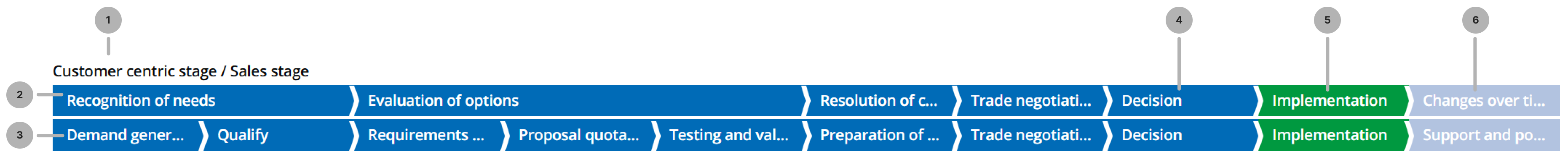
- Widget title. You can modify it by editing the translations of the source message located at
\{your instance URL}/record/source_message/167541968920999906, or by specifying another source message when you configure the values of the widget options. - Upper progress bar (the first widget). It displays the customer centric stages. This bar is filled automatically.
- Lower progress bar (the second widget). It displays the sales stages. This bar is filled as the user changes the record state.
- A completed stage. You can change the color when you configure the value of the widget options.
- The current stage. You can change the color when you configure the value of the widget options.
- A future stage. You can change the color when you configure the value of the widget options.
Configure the widget
To configure the values of the widget options, complete the following steps:
-
In the burger menu of the form where the widget is located, select Configure → Form → Layout.
-
In the Selected box, find the widget you need to configure. Click the icon to the right of the widget title.
-
In the Configure the value of the widget options modal window that appears, specify the widget parameters in the JSON format. See the examples below:
Configure the value of the widget options for the customer centric stage widget{
"click": false,
"color": "#009940",
"labelName": "Customer centric stage \/ Sales stage",
"nextColor": "#b2c3e0",
"prevColor": "#006bb7",
"choiceColumnName": "customer_centric_stage"
}Configure the value of the widget options for the sales stage widget{
"click": true,
"color": "#009940",
"labelName": "",
"nextColor": "#b2c3e0",
"prevColor": "#006bb7",
"sortColumn": "order",
"choiceColumnName": "stage"
}- click – set the value to true to enable moving the record to the next stage by clicking it in the widget.
- color – specify the current stage color in the HEX format.
- labelName – specify a source message with the widget title. The default message is available on your instance at
\{your instance URL}/record/source_message/167541968920999906. You can edit its translations to avoid creating a new source message. - nextColor – specify the future stages color in the HEX format.
- prevColor – specify the completed stages color in the HEX format.
- sortColumn – specify the system name of a column that contains the stages order in the table that contains the stages records.
- choiceColumnName – specify the system name of a Choice type column in the table on the form of which the widget is placed. The values of this column will be used as the stages displayed in the widget.
-
Click Save.
-
Repeat steps 2–4 for the second widget instance.